Inspire Chiropractic
Duration
0  Months
Length of time inside the study.
Increase In Search
1 %
Local views combined from both Search and Maps.
Increase innew clients
1 %
New clients bring money in the door for your business!
Length of time inside the study.
Local views combined from both Search and Maps.
New clients bring money in the door for your business!
Before gaining an optimal position in front of his competitors, Dr. Nolt had a great looking website that worked well for all his existing patients. This can be achieved by creating an organized website that properly displays the info that each of your customers will need to see. However, it was clear that a well designed website, does not exactly mean it was made to be Google friendly. This is large distinction that divides business websites into the two categories of having a website that is a cost, or an asset.
In the past year, we observed many changes that Google pushed out as core updates to their algorithm. As a good summary to these various updates, you could say that Google increased their focus on written content, organic local traffic, and citations made for the business websites.
Although many agencies may struggle with rank fluctuations; building your campaign on the principles that Google loves will always provide you with greater results. That means that you should start with ample written content about the services that are provided by the practice, and more so for the treatments that the Dr. specializes in. This not only provided us a solid foundation for our off-page efforts, but it also ensured that we were properly targeting the types of patients that Dr. Nolt would best be able to serve from his local area. It is worth noting that although we conducted our on-page work for Google, we did so while still placing all the right information that the viewers would need to see to get a great online experience.
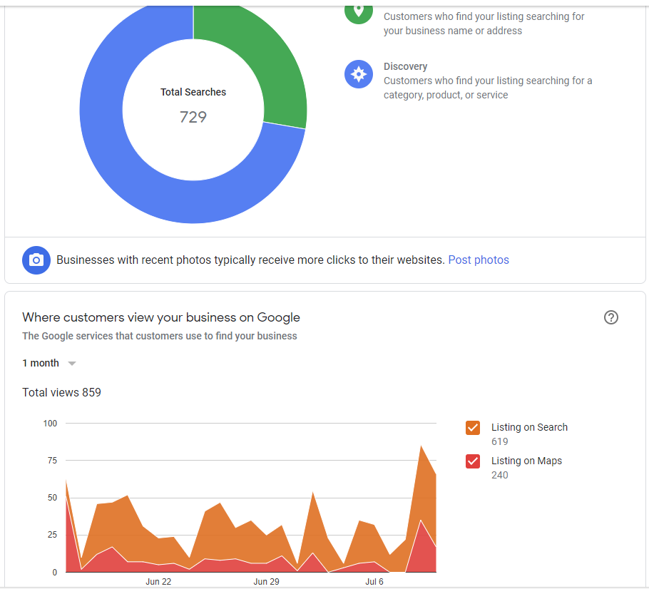
Looking at this image shows what many established business owners will see when logging into their Google My Business Dashboard.
The pie chart is a great representation of the source of your views, because it is divided into two major sections. Those who viewed your listings after searching for your business by name, and those who viewed your listings after searching for the category or service that you provide. The total number of views is not the only thing that should be considered, because you also want to focus on the fact that there are tons of new people that can find you online. That is, if you are being shown in front of your competitors.
The timeline chart shows some more valuable information that we like to study. Before beginning an SEO campaign, you can probably see a very similar result as shown above. We typically find the Maps ranking much lower than the Organic Search ranking, and this is because the Maps rank requires some additional off-page work that is specific to what Google wants to see. This is based on Local/Geo-Relevance for your business listing. Which has variations from the typical off-page efforts you can do to increase your Organic Search rank. Maps ranking techniques are newer in the SEO industry, and many methods that are used across the US can be considered experimental.
Working on the Maps rank for this campaign resulted in a very favorable increase in the impressions (views) that the business listing was getting from the local area. It is worth noting that the Google Map Pack is currently shown first above the Organic Search results, which mean that you can benefit your campaign tremendously be also achieving your top local Map rank. That is, as long as Google continues to display the Map Pack first.
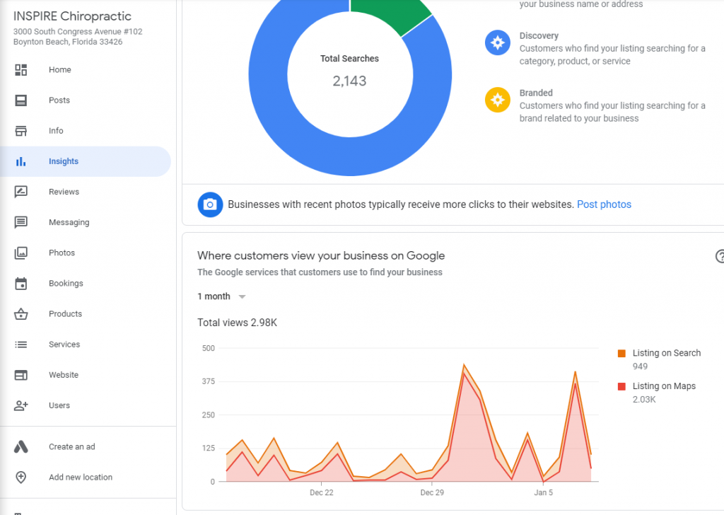
The second image is of course a lot more impressive than what we saw before the campaign could take its effect. First we can take a close look again at that pie chart on top. Yes, the views grew a significant amount. However, take a look at the distribution of those views and you can see another impressive feat that was accomplished. The growth in the views for this business listing grew from Discovery, meaning that the searches where for words like “chiropractor in Boynton Beach,” as opposed to “Inspire Chiropractic.” We pay attention to that distribution so that we can better understand the effects on local visibility that were created from our campaign.
Now checking out the bottom timeline chart, we can see a wonderful display that is a result from both an Organic Rank and the Maps Rank. The chart shows a direct correlation between the views from the Google My Business listing, as well that Organic Rank that is shown below the Map Pack. This tight correlation is only found once you have achieved both top local ranks. It is also a great sign that our work as SEO marketers has been successful.
After combining our industry leading campaign methods with Dr. Nolt’s excellent treatments for his patients, we were able to create a long term strategy for passively attracting new patients from the superior local visibility.